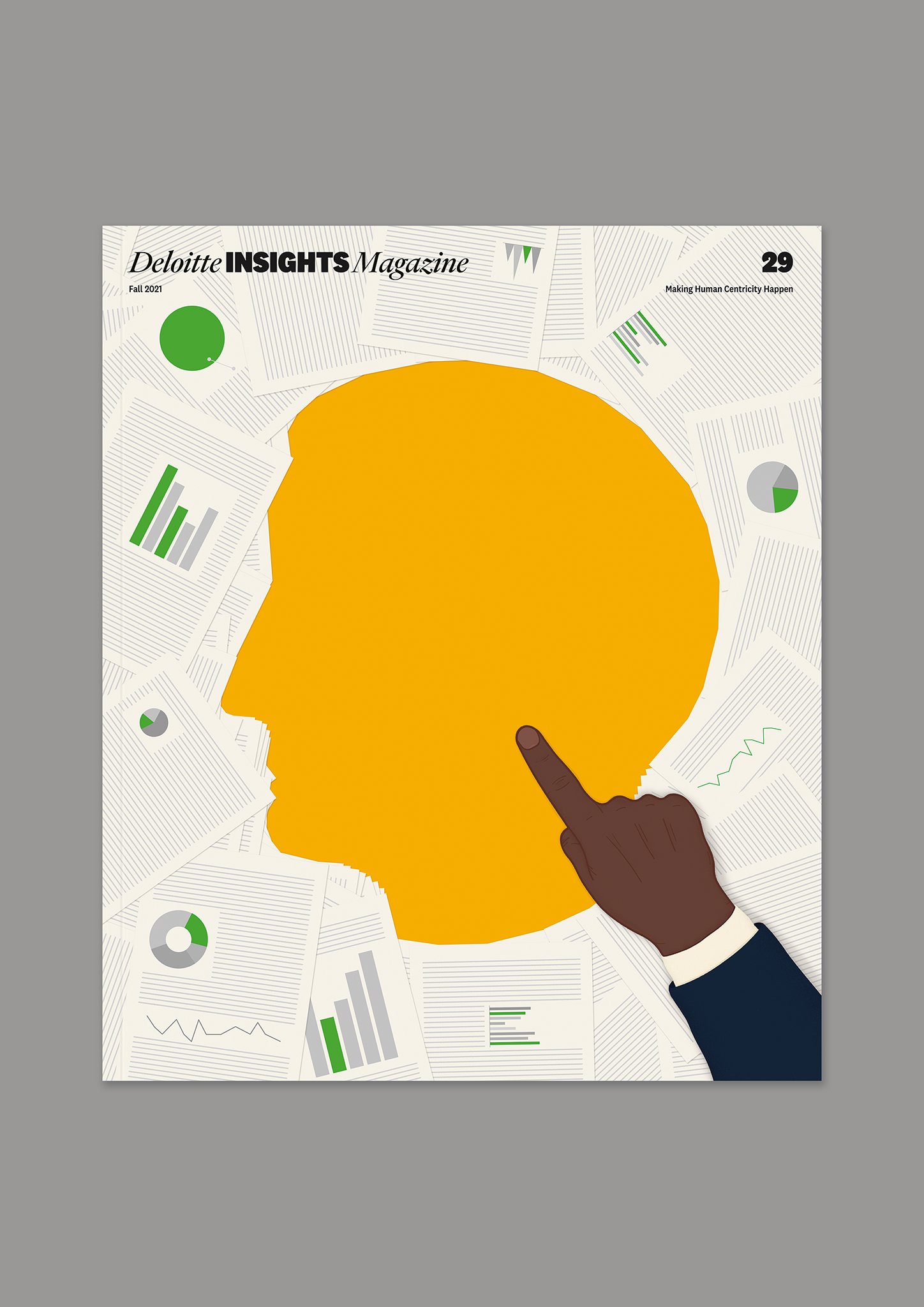
One of the versions featured a hand with the index finger pointing into the supposedly empty centre of the cover, additionally doing an accent on the silhouette of a human head.
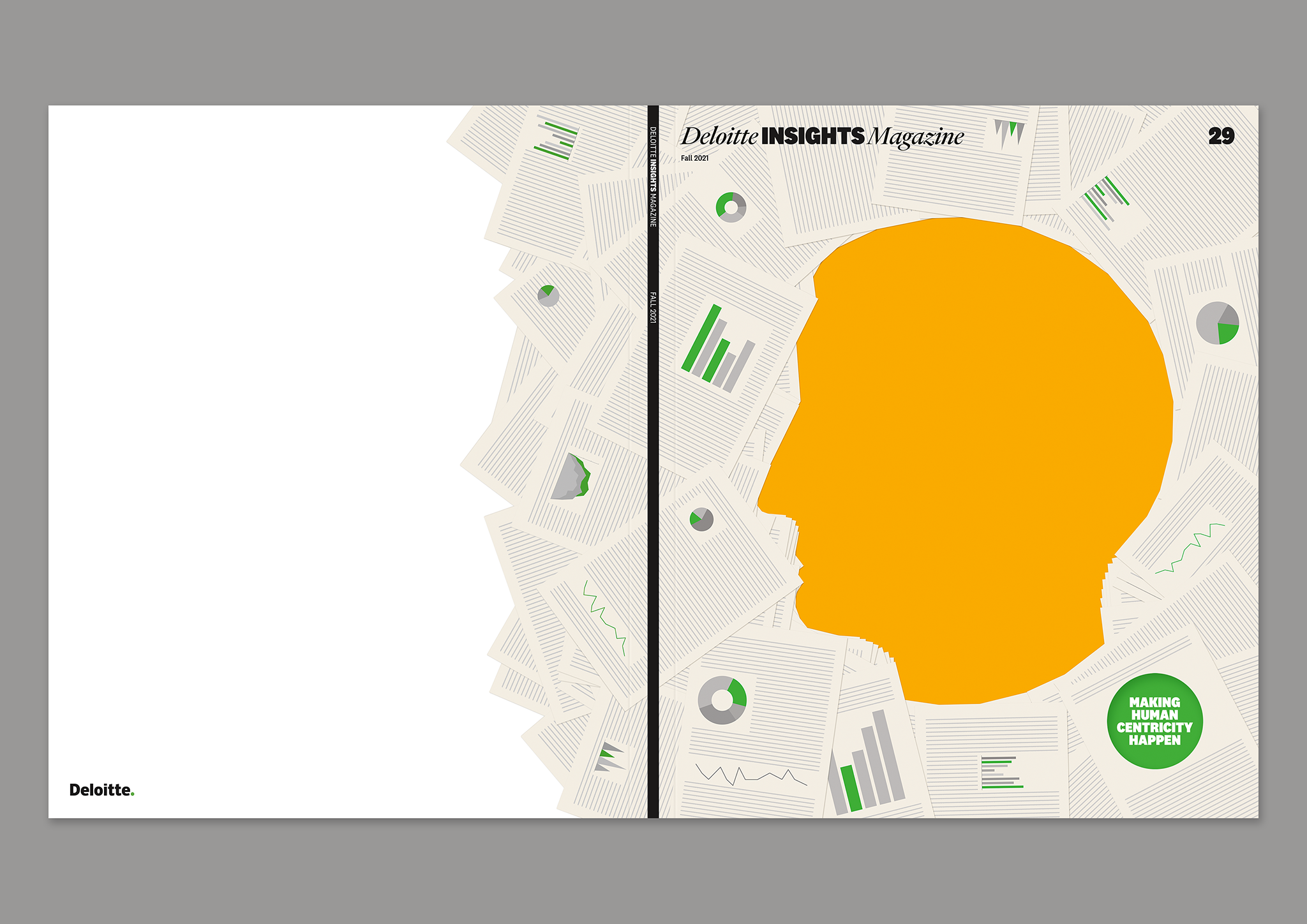
However, for the final version, Matt Willey suggested that instead of a hand in the bottom right-hand corner, on one of the drawn sheets, a circle be made which would be cut out in the print edition, and under it, on another page, would be a green circle with the words 'MAKING HUMAN CENTRICITY HAPPEN'.
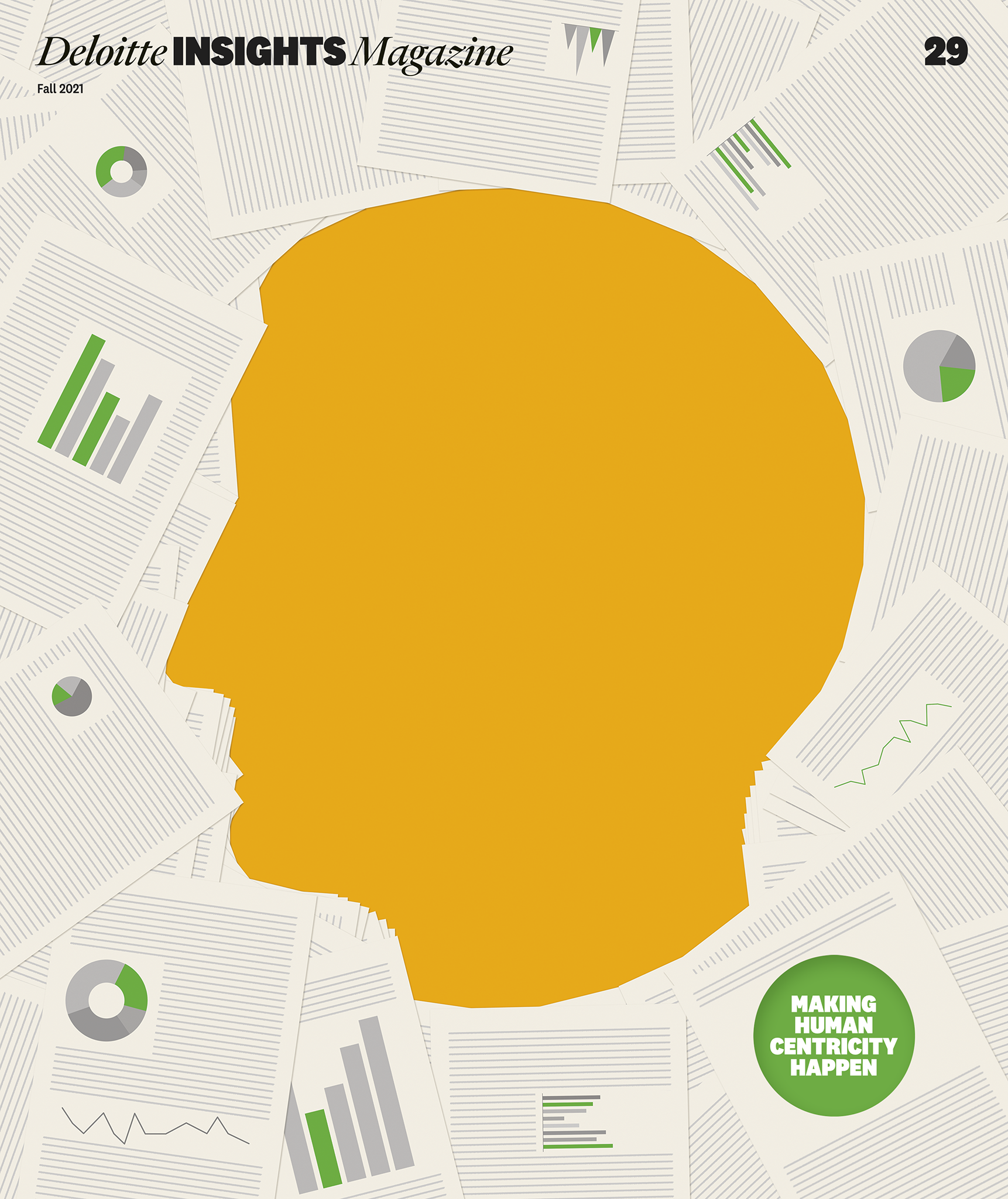
Making Human Centricity Happen
Deloitte Insights Magazine
Deloitte Insights Magazine
For decades, leading strategic and organisational thinkers have written about the importance of bringing humanity to business. Industrialisation, automation and AI-enabled efficiency have resurfaced the topic over the years, but history very likely will mark 2020 and 2021 as a tipping point.
Stakeholder capitalism; customer centricity; climate change; health equity; and diversity, equity and inclusion initiatives are top of mind for C-suites nowadays. Conversations about employee satisfaction and loyalty now are peppered with questions about how companies can support employees’ well-being. Conducting team management and collaboration in 100% remote work environments has highlighted the value of emotional intelligence in the workplace.
Clients know that they need to take a more human-centered approach to business. And the 29th issue of the Deloitte Insights Magazine offers actionable insights on how to make it happen.
AD: Matt Lennert
Design: Matt Willey, Pentagram
Editor in Chief: Elisabeth Sullivan
The aim was to create a cover that, in a simple but very direct way, would show that in the business world the most important are people. (It was also important to use in some way the green circle, a distinctive element of Deloitte's identity).
In the end, around 20 concepts were created and explored (some suggested using layer-scratch, bubble wrap or allusions to Vitruvian Man, etc.). We decided on an idea that would not pose technical difficulties, while literally and symbolically 'highlighting' the shape of the head in the centre of the cover, leaving aside all the papers with numbers and diagrams.
The yellow colour was not chosen at random – it is a symbolic representation of "spotlight" and at the same time is a more delicate symbol of "attention" than red. This made the cover itself noticeable and the shape of the human head so obvious that when entering the room - from a distance the magazine on the table is noticeable and catches the eye.
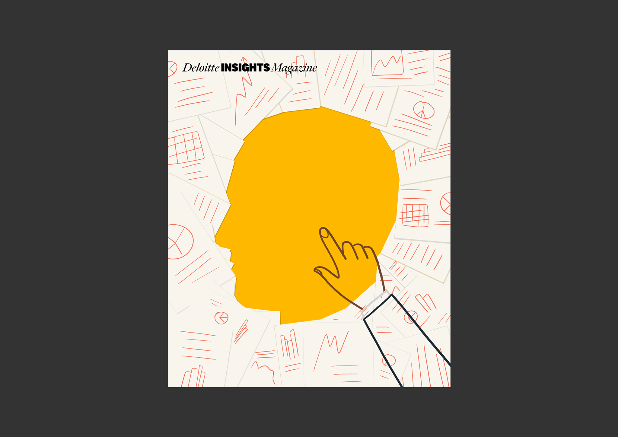
The rough sketch of the chosen idea looked as follows:
All work copyright © Vadym Solowski